
Painting your home is one of the most impactful decisions you can make when it comes to enhancing its aesthetic appeal. Choosing the right paint colors is essential, as colors can significantly influence the mood and ambiance of your space. This guide will explore how to match paint colors to your home’s unique style, ensuring you enhance and showcase its architectural beauty.
Understanding Your Home’s Architectural Style
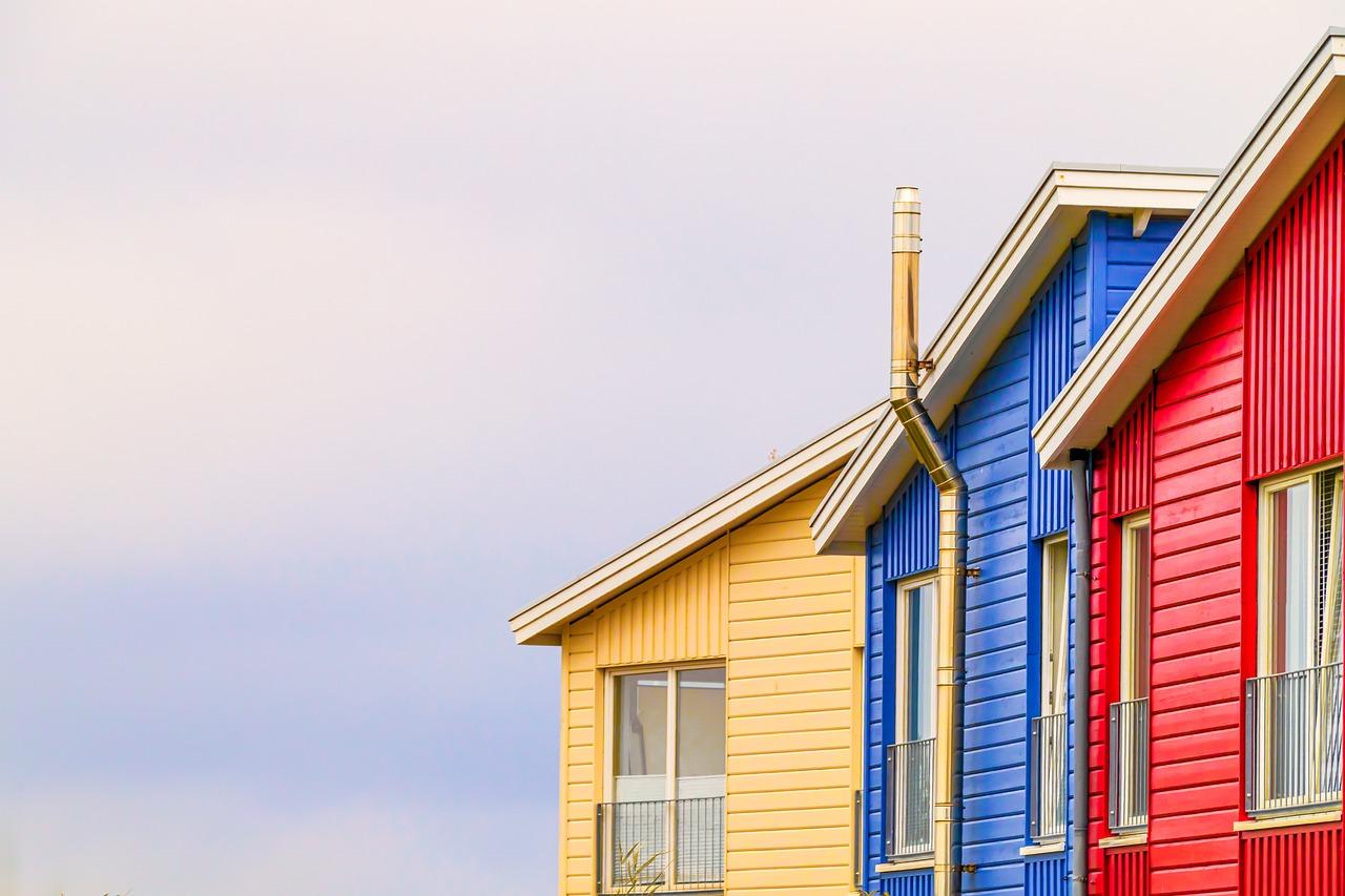
Before diving into color selections, it’s vital to understand your home’s architectural style. Recognizing the style helps you choose colors that complement the design. For instance, traditional homes often look best with muted, classic colors like creams and shallow blues, while modern homes may benefit from bold, bright hues or even monochromatic schemes. Each architectural style conveys a feeling, and colors play a crucial role in that emotional perception. For example, a Victorian home might be well-suited for rich jewel tones, whereas a farmhouse might require softer pastels. Assessing features like trim, siding materials, and overall structure can guide your color choices effectively.
Consider the Mood You Want to Create
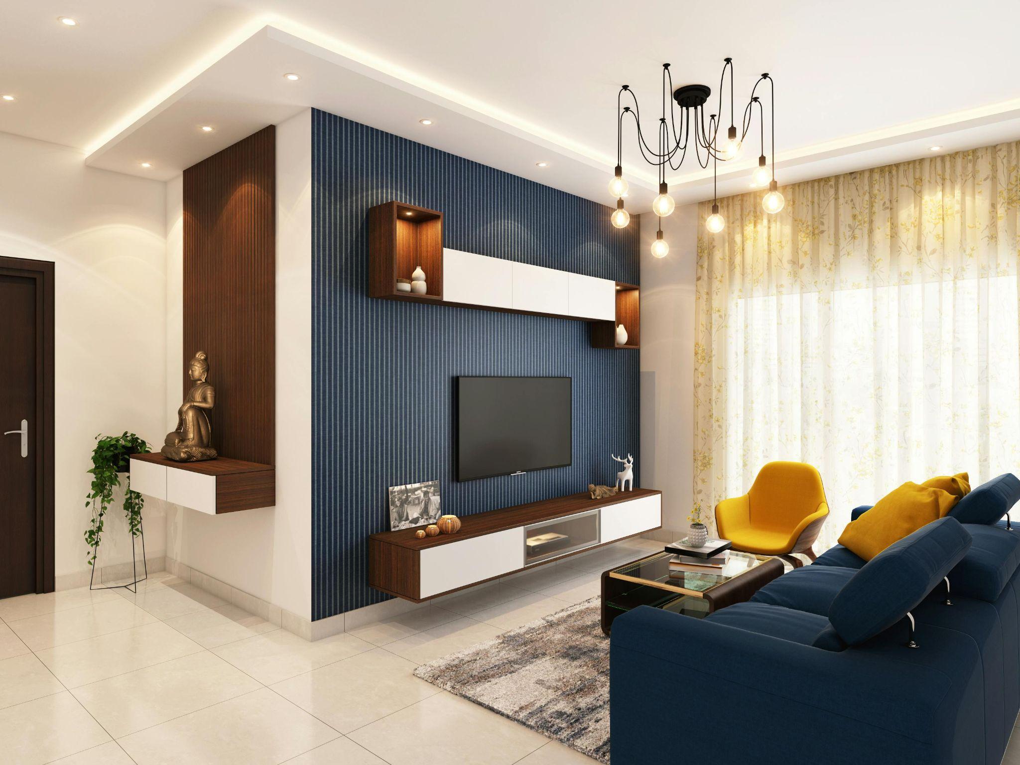
Creating a specific mood in your home involves understanding how colors affect emotions. Warmer colors like reds, oranges, and yellows can generate feelings of warmth and comfort, making them ideal for social spaces such as living rooms and kitchens. Conversely, cooler colors like blues, greens, and purples exude calm and tranquility, making them suitable for bedrooms and bathrooms. In particular, consider the following: - Warm Colors: Invigorate spaces and ignite creativity. - Cool Colors: Promote relaxation and concentration. - Neutral Colors: Provide versatility and balance, blending seamlessly with various styles. By outlining the atmosphere you wish to evoke, you can narrow down color options that align with your desired mood.
Testing Paint Samples in Your Space
Once you’ve identified a color range, the next step is testing samples in your home. Paint can appear drastically different depending on lighting conditions—natural light versus artificial light affects how colors look throughout the day. Applying samples on your walls allows you to observe how they interact with your space. Consider following steps when testing. Select a few colors that resonate with your style. Paint small swatches on multiple walls to see how they look at different times of day. Observe how the paint color complements your furnishings and decor. By taking the time to test paint colors, you can avoid costly mistakes and ensure your selected shades harmonize with your existing interior design.
Incorporating Trends While Maintaining Timelessness
It’s exciting to incorporate design trends, but blending them with timeless elements is essential for a long-lasting appeal. Fad colors might feel less appealing after a few years, so focus on hues that offer longevity while allowing for seasonal updates through accessories and furnishings. For 2023, popular color trends include earthy tones, muted greens, and deep blues. These colors provide a beautiful backdrop and can work within diverse styles, from modern to rustic. Consider using bold trim or an accent wall to experiment with trendy shades while keeping your primary palette neutral. This approach preserves the vibrancy while ensuring a more classic, cohesive look in your home.
Seeking Professional Help
Sometimes, despite your best efforts, achieving the perfect paint selection can become overwhelming. Seeking assistance from professional painters can provide clarity and guidance—in their hands, they can elevate your vision into reality. Professionals can help you understand color theory and even provide insights into the latest design trends. They can assist you in navigating potential pitfalls, such as color clashes or inappropriate choices for specific rooms, which is particularly valuable in open-concept spaces where transitions are important. By collaborating with skilled professionals, you may even find new color combinations you had not previously considered, enriching your entire design experience and offering a unique flair to your home.
Coordinating Trim and Accent Colors
When selecting paint colors, don’t overlook the importance of trim and accent colors. The interplay between wall colors and trim can define a room’s character. White trim is traditional, while bold hues can add drama and modernity. Begin with the primary wall color, then explore how varying shades of the same color or complementary colors work for your trim and accents. A classic choice often includes pairing grays with crisp whites or pastels with earth tones. For an adventurous look, consider contrasting dark door frames against lighter wall colors or vibrant accents. This added dimension can enhance the overall aesthetic, creating a visually appealing environment.
Functionality and Practical Considerations
While aesthetics hold considerable importance, functionality must also be addressed. Rooms with high traffic or exposure to elements, like kitchens and bathrooms, should consider finishes that not only look good but also stand the test of time. For example, washable paint finishes can simplify maintenance, while brighter colors can help create an illusion of a larger space. Think about durability and care when selecting paint for spaces used frequently. For instance, semi-gloss or satin finishes usually work well in kitchens due to their longevity and ease of cleaning. In contrast, matte finishes may suit less-used areas, creating a softer look without compromising style.
Updating Existing Spaces with Paint
Paint holds remarkable power in transforming existing spaces. Whether refreshing a tired room or entirely reimagining your living areas, the right colors create an entirely new atmosphere. A simple coat of paint can make a room feel larger, brighter, or cozier depending on the choices made. To make the most of your update, consider the existing furnishings and design elements that will remain. Identify colors that either harmonize or act as dynamic focal points. You might opt for a more vibrant accent wall behind a neutral color sofa to show off your style without overwhelming the space. Ultimately, paint updates are an accessible way to personalize your home’s interior while making impactful changes that reflect your evolving tastes.
After settling on your perfect paint colors, don’t forget about accessories and decor. The final touches complete the look of your rooms and provide dimension and depth. Consider using throw pillows, rugs, artwork, and other decor elements to draw out the colors you’ve chosen and create unity throughout your home. Choosing complementary decor can enhance the overall impact of your color scheme, making everything feel tied together rather than disconnected. Accessories that reflect your personal style can accentuate the qualities of your new color choices, allowing your living spaces to feel genuinely personalized and inviting. By following these guidelines, you’ll navigate the complex world of paint color selection with confidence. Choosing the right paint is not merely about aesthetics; it involves a deeper understanding of your home’s style and how colors influence the atmosphere. With the right strategy, you’ll create a cohesive look that reflects your taste and welcomes warmth into your home.